Selected craft
My working inventory across various forms of data visualisation: editorial, long-form data journalism, interactive and immersive, data art, generative data, and data physicalisation.
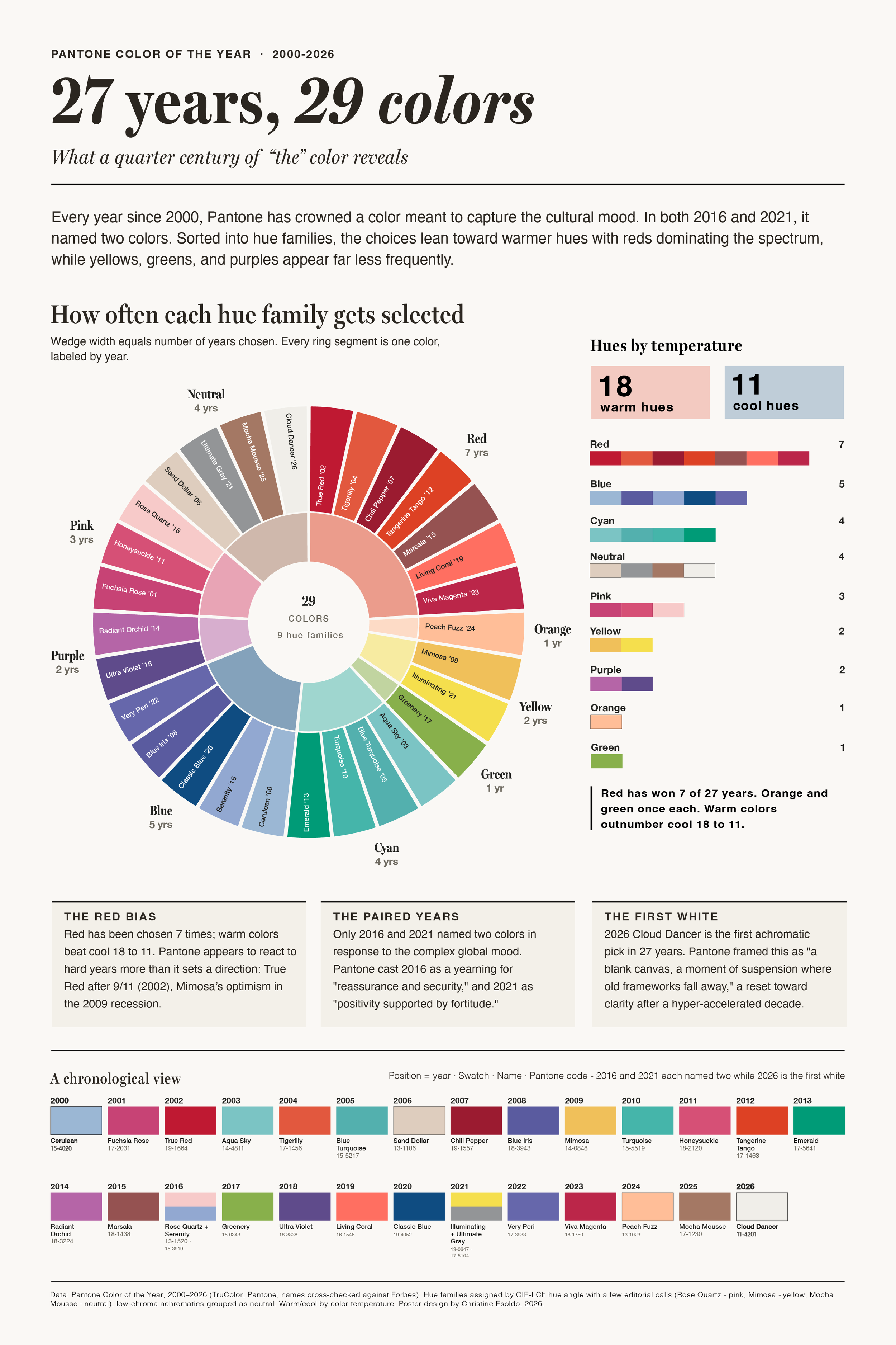
Pantone Color the Year: 27 years, 29 colors
Editorial data visualisation · 2026An interactive analysis of Pantone's Color of the Year selections since 2000 in two form factors:
Static poster
Interactive data visualisation - frequency, temperature, and shifts in chroma and naming
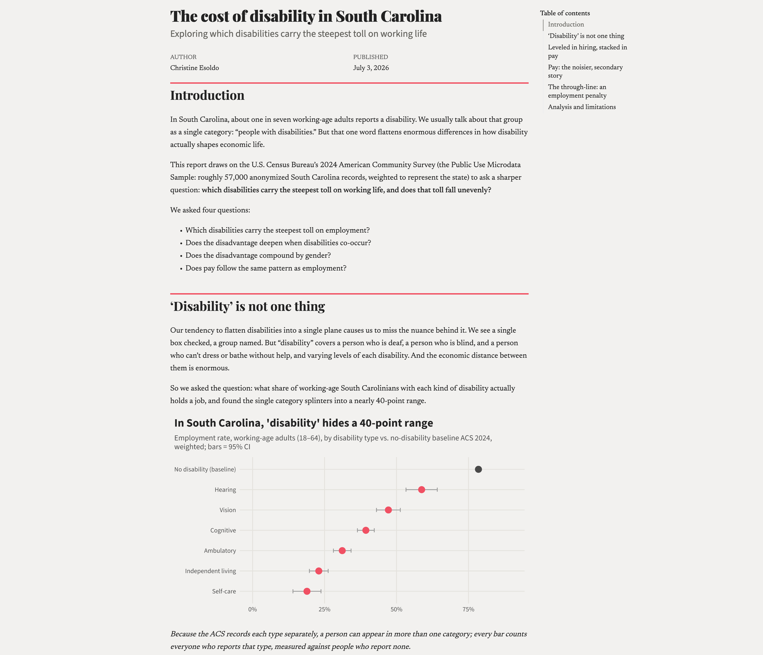
The cost of disability in South Carolina
Long-form data journalism · 2026A report drawing on the U.S. Census Bureau's 2024 American Community Survey to examine which disabilities carry the steepest toll on working life in South Carolina, and where the disadvantage compounds.
Multiple weighted analyses rendered inline with the argument. The through-line: cost of disability is, first and most consistently, an employment disadvantage.
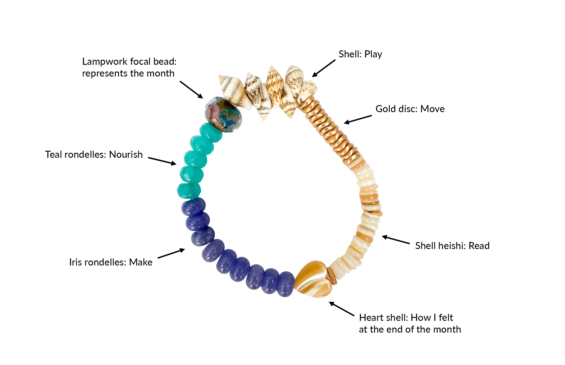
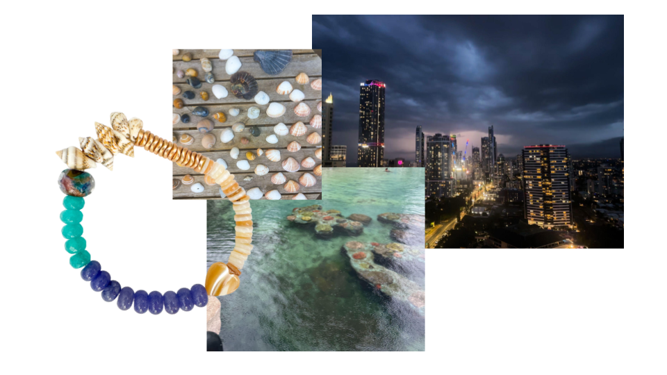
Presence, Rendered: tracking a month of analog activities
Data physicalisation · 2026 (ongoing)Each month, I track six categories of my personal life : movement, making, play, reading, nourishment, mood. Then, I translate them to a jewellery artefact. This was February’s.